Included
Live Preview Details
Website Templates
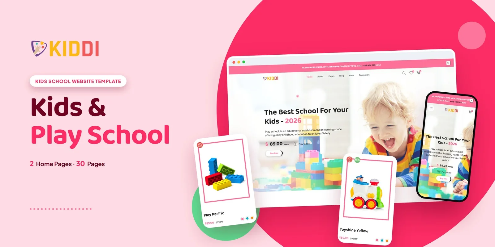
Kiddi – Bootstrap 5 Kids School HTML5 Website Template
Formats: HTML5Tailwind CSSPHPReact+2
by MetropolitanHost · updated Nov 1, 2026
Download this template, and every other one, with All-Access.
Need only this one? Buy it alone for $18 on MetropolitanHost
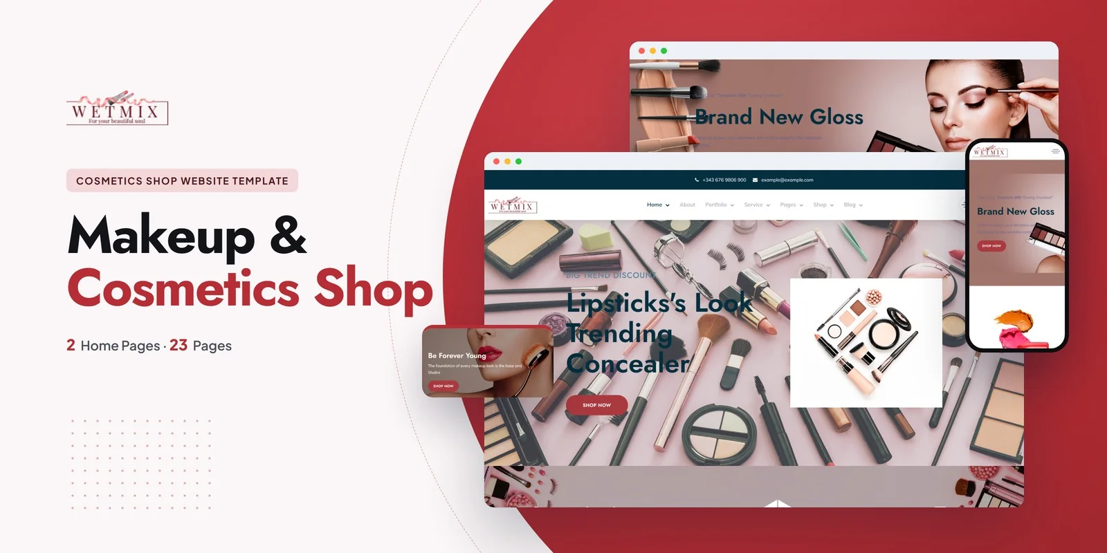
Give a cosmetics or skincare label a full online store in 23 pages with this Tailwind CSS beauty brand template, which Wetmix builds with Tailwind CSS 4 handling the styling. It suits beauty brands, cosmetics retailers, skincare stores, makeup shops and personal care sellers. Web designers and studios can also use it to hand a finished beauty site to a client quickly.
The shop is the part of this template that matters most, because a beauty buyer compares products before paying. Wetmix gives you four product archive layouts:
The sidebar versions pair with an ionRangeSlider price filter, so shoppers can narrow a range of serums or lipsticks by cost. Isotope filtering also sorts items by category or product type.
Shop Detail comes next. Hovering over a product photo magnifies it, so a customer can inspect a texture or shade swatch up close. Cart, Checkout and Wishlist then complete the purchase flow, and the wishlist lets shoppers keep products they want to buy later.
As a Tailwind CSS beauty brand template, Wetmix also covers the content around the shop, such as services, a lookbook and specialist profiles. A buyer who wants a Tailwind CSS beauty brand template will find that the two homepages differ in hero style, so you can test which one fits your collection. Both homepages use Slick carousels for featured products and Parallax backgrounds for depth.
Beauty brands often sell more than bottles, so the template includes pages for the work behind the products.
CounterUp adds animated counters, which work well for client or product totals. The Instagram Feed section also brings your social posts onto the page as proof of real use.
Editorial content helps a skincare brand explain ingredients and routines. Wetmix offers a standard Blog and a Blog Grid, plus a Blog Detail page for full articles. FAQ answers product and ordering questions before customers write in. Contact Us holds the form and the salon location, and About Us holds the brand story and mission.
Each product card keeps its hover and focus states right beside its base classes, so its behavior is visible where you edit it. Breakpoint prefixes written mobile-first let the layouts adjust to the viewport, which keeps the shop grids readable on phones. Because the classes sit on the elements themselves, you can lift a block, such as the Wishlist row or a service card, onto another page without losing its styling.
Every page in the download works in a browser with no build step. If you want to adjust colors or spacing, the Tailwind source is there to edit and rebuild. The photos from the preview are not included. Plain placeholder images sit in their place until you drop in your own product photography. Icons come from Flaticon and FontAwesome, and the typefaces load from Google Fonts. Image credits go to Freepik and Unsplash.
The package also works across Chrome, Firefox, Safari, Edge and Opera, and it ships with step-by-step documentation for setup and customisation.
v1.0 2026-11-01
Website Templates
Formats: HTML5Tailwind CSSPHPReact+2
Website Templates
Formats: HTML5Tailwind CSSReactVue+1
Website Templates
Formats: HTML5Tailwind CSSPHPReact+2