Included
Live Preview Details
Website Templates
Woodbhai – Bootstrap 5 Wood Timber HTML5 Website Template
Formats: HTML5Tailwind CSSPHPReact+2
by MetropolitanHost · updated Nov 1, 2026
Download this template, and every other one, with All-Access.
Need only this one? Buy it alone for $18 on MetropolitanHost
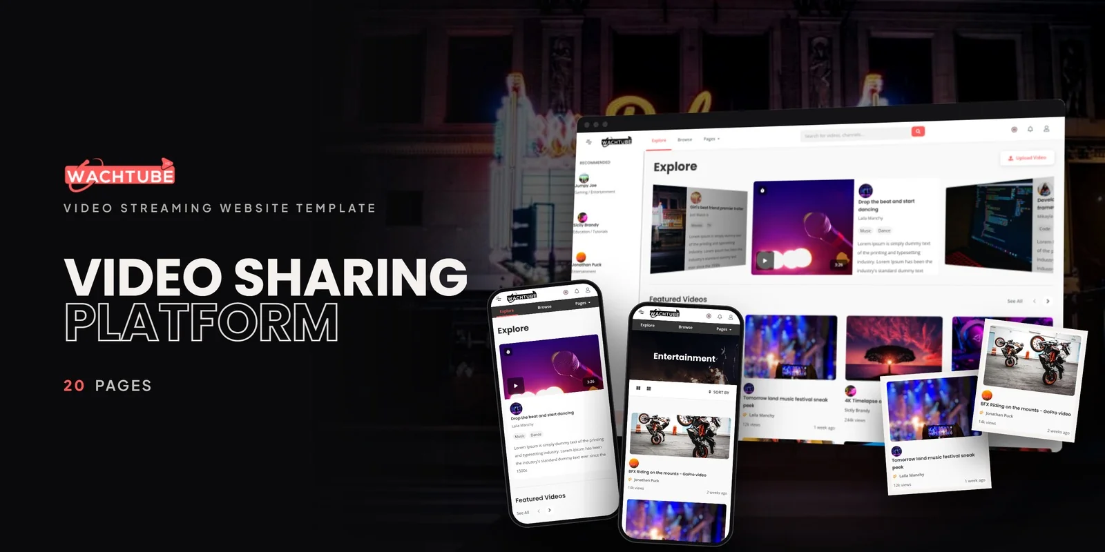
Video platforms need pages for two kinds of visitors: people who watch and people who upload. Wachtube is a Tailwind CSS video template using Tailwind CSS 4, with 20 pages that cover watching, browsing, channel management and membership. It suits streaming platforms, YouTube-style channels, media hosting services, creators and online entertainment networks.
The set has one home layout, and the remaining pages follow the path a viewer or creator takes through a video site. Here is how they group:
Swiper powers the featured video sliders, and SlimScroll gives sidebars and content areas a custom scrollbar.
Most video sites win or lose on how creators manage their content, so the my-channel pages matter most here. Wachtube is a Tailwind CSS video template with six management pages in that suite, so a creator can handle videos, playlists and subscribers without leaving the dashboard. The History and Watch Later pages serve viewers, because they bring people back to videos they have not finished.
The Single Video page is the second page to work on. It is where people spend their time, so it deserves the most careful edits to player size, description text and related content. Browse and Video List come next, because they decide how quickly a visitor finds something to watch.
The Membership page presents subscription tiers, so a media hosting service can show what each plan includes. Login and Register handle both viewers and creators. The Account page in the channel suite holds settings, while the Help Center answers common platform questions.
The compiled CSS holds only the classes this template calls for, so leftover styles stay out of the file. Hover and focus states are written right in the markup, so you can change a video card or a subscribe button in one place. Mobile-first breakpoint prefixes resize each layout, which matters for the Single Video and Browse pages when viewers switch between phone and desktop.
You can open the pages in a browser right away. The Tailwind source files are also in the download, so you can edit the styles and rebuild them. The preview photos are not part of the package, and plain placeholder images fill those spots, which leaves room for your own thumbnails and channel art. Flaticon and FontAwesome provide the icons, Google Fonts provides the typefaces, and the documentation walks through setup and customisation.
The preview imagery was sourced from Freepik and Unsplash, and every page works in Chrome, Firefox, Safari, Edge and Opera.
v1.0 2026-11-01
Website Templates
Formats: HTML5Tailwind CSSPHPReact+2
Website Templates
Formats: HTML5Tailwind CSSPHPReact+2
Website Templates
Formats: HTML5Tailwind CSSPHPReact+2
Website Templates
Formats: HTML5Tailwind CSSPHPReact+2