Included
Live Preview Details
Website Templates
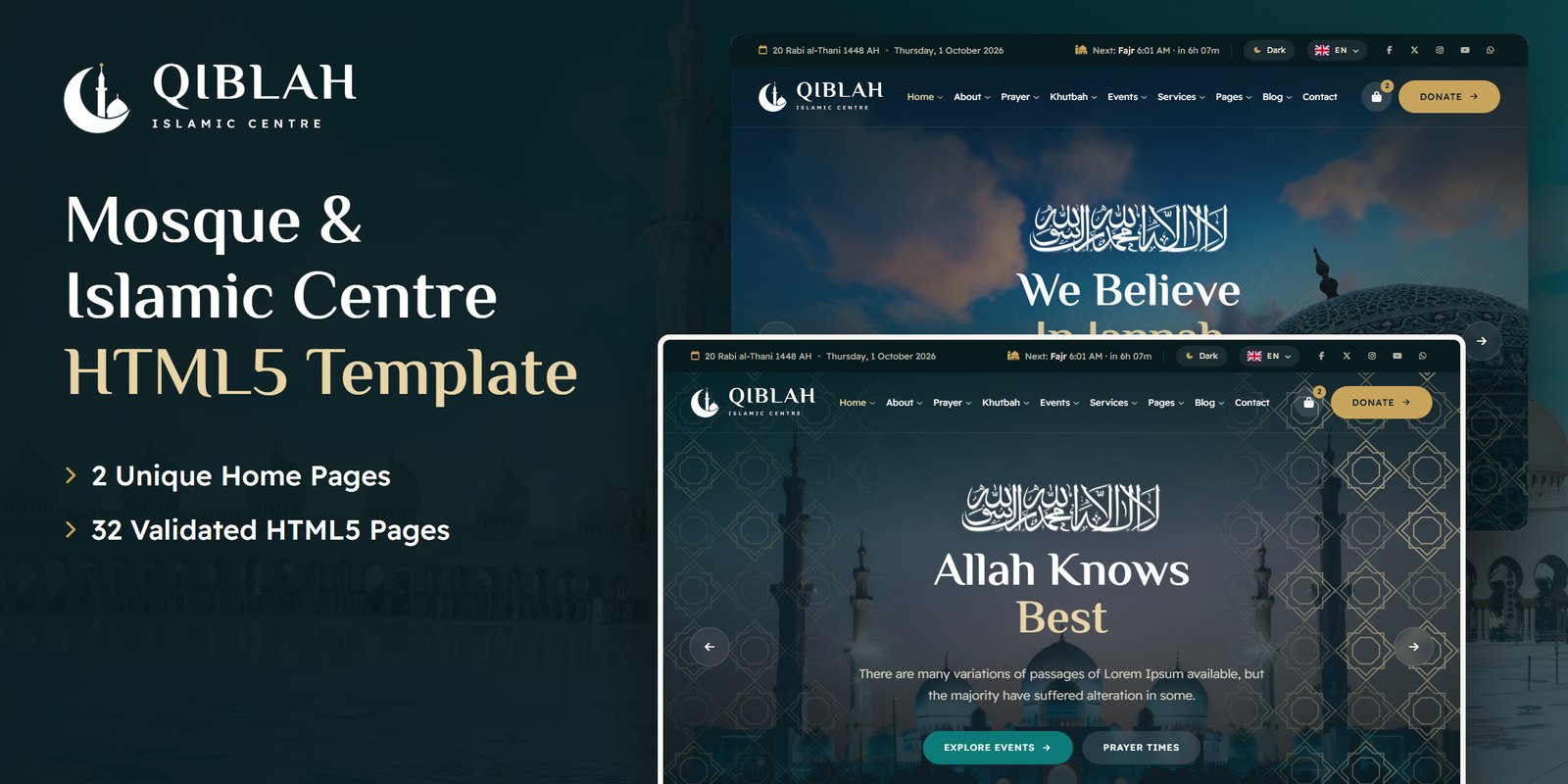
Qiblah — Mosque & Islamic Centre HTML5 Template
Formats: HTML5Tailwind CSSReactVue+1

by MetropolitanHost · updated Nov 1, 2026
Download this template, and every other one, with All-Access.
Need only this one? Buy it alone for $18 on MetropolitanHost
Agencies that sell social campaigns need a site that shows finished work first, and Smedia, a Tailwind CSS social media template, is built around that, running on Tailwind CSS 4. It suits digital media agencies, creative studios, marketing firms and brand communications companies. Freelancers who build sites for those clients can also use it as a starting point.
The template ships with 12 HTML pages, and two of them are alternative home layouts. The remaining pages cover the work an agency has to show and explain:
Slick carousels handle featured projects and client testimonials. Magnific Popup opens portfolio images in a lightbox, and ionRangeSlider adds interactive range elements to a section when you need them.
Every page in this Tailwind CSS social media template targets a task a social media studio does each week, such as pitching a client, presenting a case study or introducing the team. Of those, the Portfolio archive and Portfolio Details pages matter most to an agency. A prospect who lands on the site wants proof, so the archive lists projects and each detail page tells one campaign in full.
The Services page comes second, because it turns that proof into an offer. The Team page then answers who will do the work. Blog posts support all of these pages by showing how the agency thinks.
Because the Tailwind CSS social media template includes a pair of home layouts, a studio can choose a bolder or a calmer first impression. Both start with a hero and a creative showcase, so you can pick the one that fits your brand and delete the other. Both link into the same portfolio, services and team pages.
Styling is written as utility classes in the HTML, so you can read how a portfolio card or a service block looks right where it sits and change it there. Colors, fonts and spacing live in a single Tailwind theme, so a brand color change reaches the Home, Portfolio and Blog pages together. The compiled CSS keeps just the classes these pages call, so unused styles stay out.
In the download, every finished page opens straight in a browser. Tailwind source files sit alongside them, so you can edit the styling and compile it again. The preview images are not part of the package. Plain placeholder images fill those slots until your own client work goes in. The design uses Flaticon and FontAwesome icons plus Google Fonts typography, and the included documentation explains installation and customisation.
Browser support covers Chrome, Firefox, Safari, Edge and Opera, and the original photography is credited to Freepik and Unsplash.
v1.0 2026-11-01
Website Templates
Formats: HTML5Tailwind CSSReactVue+1
Website Templates
Formats: HTML5Tailwind CSSPHPReact+2
Website Templates
Formats: HTML5Tailwind CSSPHPReact+2
Website Templates
Formats: HTML5Tailwind CSSPHPReact+2