Included New
Live Preview Details
Website Templates
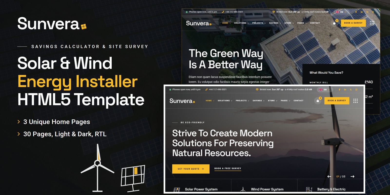
Renewable Energy Website Template – Sunvera HTML5
Formats: HTML5Tailwind CSSReactVue+1
by MetropolitanHost · updated Nov 1, 2026
Download this template, and every other one, with All-Access.
Need only this one? Buy it alone for $18 on MetropolitanHost
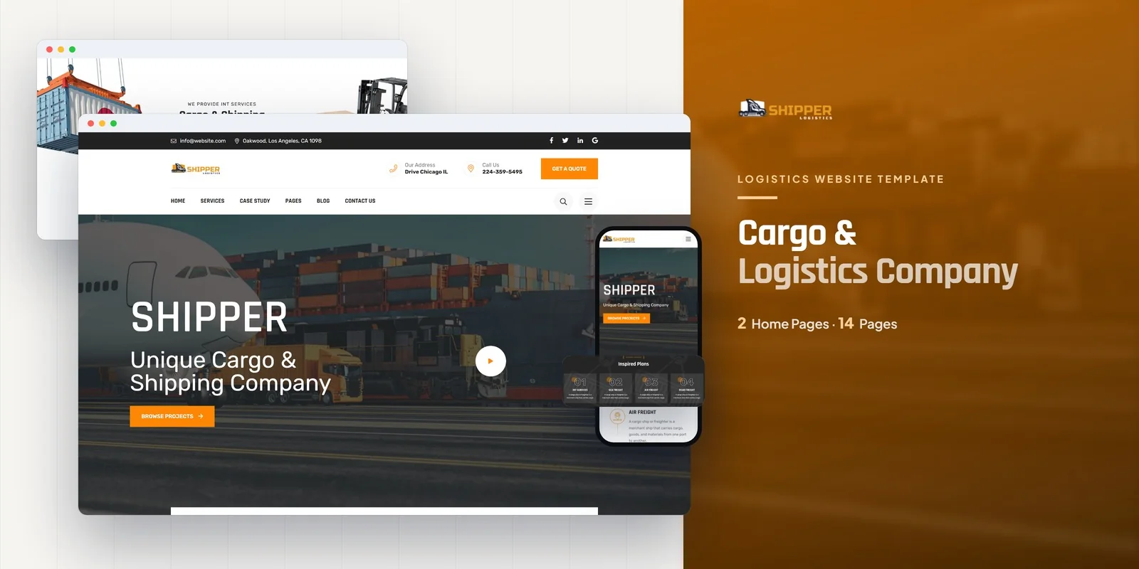
Freight offerings, case studies and shipping questions reach buyers quickly with Shipper, a Tailwind CSS logistics services template written for Tailwind CSS 4. It suits logistics companies, cargo shipping firms, express delivery services, freight forwarders and supply chain businesses. Web agencies can also use it to hand a finished logistics site to a client quickly.
The Tailwind CSS logistics services template gives you 16 pages and 2 home layouts, so a carrier can choose the hero style that fits its brand. The pages are grouped by what a shipper needs to check before sending a request.
Services and Case Studies carry the most weight. A buyer comparing carriers wants to see what you move, then proof that you have moved it before. Because both pages can be filtered by category with Isotope, a visitor looking for one type of freight reaches it fast.
The FAQ page comes next. Shipping customers ask about timing, handling and quotes, so answering those questions early means fewer calls. The Contact page then catches the visitor who is ready to ask for a quote.
For a freight forwarder, this Tailwind CSS logistics services template lets visitors filter services by category before they open a single page. The two home layouts also let a company lead with either its services or its track record.
CounterUp animates figures such as shipments delivered and clients served, so a cargo firm can show its scale on the home page. Slick carousels present featured services and client testimonials. WOW.js reveals sections as the visitor scrolls, and Magnific Popup opens project images full screen.
An express delivery service can also use the Countdown timer to show a cut-off time for same-day dispatch. The icon sets are Flaticon and FontAwesome, while Google Fonts handle the type.
Every button and menu item has its hover and focus styles written beside it, so you can read it in one place. Each section keeps its styling with its HTML, so you can copy a Case Studies block or a counter row to another page and the design stays intact. Mobile-first breakpoint prefixes resize each layout for the screen, which matters when dispatchers check the site from a phone.
Open the pages in a browser right away, with no build step needed. The package includes the Tailwind source, so changing the styles means editing it and compiling again. The preview images are left out of the package, so generic placeholder pictures fill each slot, and you can swap in your own shipping photos at any time. Step-by-step documentation covers setup and customisation, and image credits go to Freepik and Unsplash.
The template works in Chrome, Firefox, Safari, Edge and Opera.
v1.0 2026-11-01
Website Templates
Formats: HTML5Tailwind CSSReactVue+1
Website Templates
Formats: HTML5Tailwind CSSPHPReact+2
Website Templates
Formats: HTML5Tailwind CSSPHPReact+2
Website Templates
Formats: HTML5Tailwind CSSPHPReact+2