Included
Live Preview Details
Website Templates
Vinely – Bootstrap 5 Craft Brewery HTML5 Website Template
Formats: HTML5Tailwind CSSPHPReact+2
by MetropolitanHost · updated Nov 1, 2026
Download this template, and every other one, with All-Access.
Need only this one? Buy it alone for $21 on MetropolitanHost
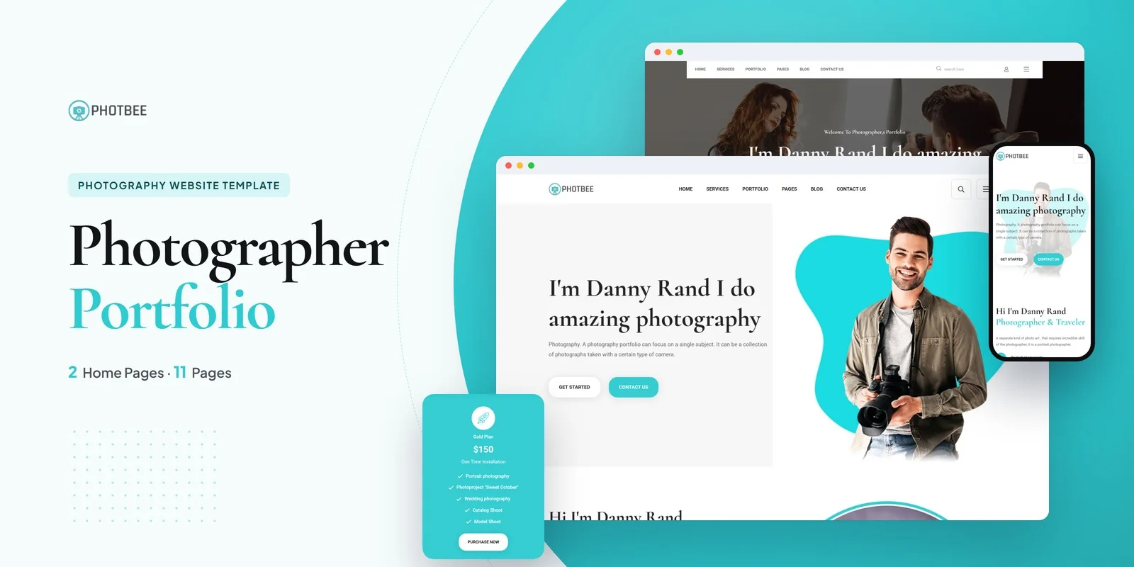
Photbee presents a photography studio’s work through a portfolio archive, service pages, a team directory and a blog, with Tailwind CSS 4 handling the styling. Photbee is a Tailwind CSS studio photography template that lets a studio show its shoots in a filterable portfolio, list its services and introduce its team, using Tailwind CSS 4 for every page.
It suits studios, freelance photographers, visual arts agencies and web agencies that need a finished photography site for a client. The set adds up to 11 pages, with 2 different home layouts among them.
The Tailwind CSS studio photography template includes a portfolio archive with a detail page for each project, so every shoot gets its own space. Visitors can filter the archive by category or style with Isotope, and ImagesLoaded keeps the grid from jumping while photos load. Magnific Popup opens any image full screen.
Slick carousels handle featured work and client testimonials. CounterUp animates figures such as projects completed or clients served, so a studio can show its track record on the home page. In addition, ionRangeSlider adds a price range filter for service packages.
A freelancer can lead with the portfolio and service details, while an agency can use the team page and blog to show depth.
The portfolio is usually the first thing a buyer edits, because the sample images tell visitors nothing about their own work. In the download, neutral placeholders replace the preview images, so your own shoots go into the Portfolio and Portfolio Details pages first. Next, change the studio name, service list and team members.
A Tailwind CSS studio photography template for client work can use the 2 home layouts as two different starting points. A single Tailwind theme definition holds the palette, typefaces and spacing, so a brand change there reaches every page. Responsive prefixes written directly in the markup, starting from the smallest screen, resize each layout, which matters for image-heavy galleries viewed on phones.
The compiled pages work as soon as you open them in a browser. The download also holds the Tailwind source, which lets you change the styling and compile it again. Flaticon and FontAwesome supply the icons, Google Fonts supplies the typefaces, and the documentation explains setup and customisation. The template works in Chrome, Firefox, Safari, Edge and Opera.
Photo credits for the original design go to Freepik and Unsplash.
v1.0 2026-11-01
Website Templates
Formats: HTML5Tailwind CSSPHPReact+2
Website Templates
Formats: HTML5Tailwind CSSPHPReact+2
Website Templates
Formats: HTML5Tailwind CSSPHPReact+2
Website Templates
Formats: HTML5Tailwind CSSPHPReact+2