Included
Live Preview Details
Website Templates
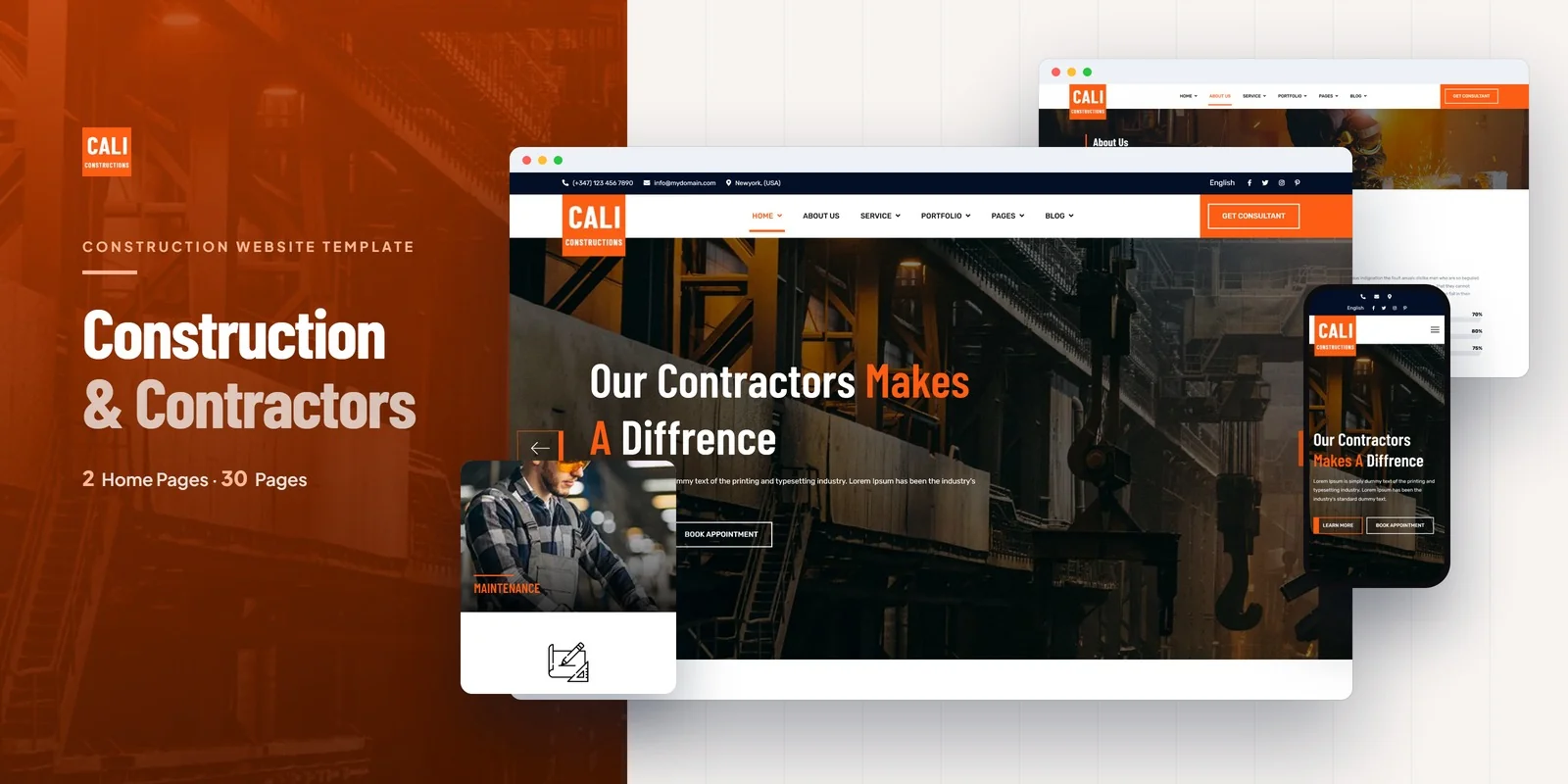
Cali Constructions – Bootstrap 5 Construction Company HTML5 Website Template
Formats: HTML5Tailwind CSSPHPReact+2

by MetropolitanHost · updated Nov 1, 2026
Download this template, and every other one, with All-Access.
Need only this one? Buy it alone for $18 on MetropolitanHost
Brands that sell products, run events and show their work get all of it in one site with Imperuim, a Tailwind CSS 4 build with 27 pages and 2 home layouts. As a Tailwind CSS multi-purpose brand template it puts a working online shop, an events archive and a gallery in the same site. It suits businesses, creative studios, agencies, online stores and freelancers who build one site for several kinds of content.
A brand that sells products, runs events and shows its work needs a Tailwind CSS multi-purpose brand template where those parts already connect. Of the 27 pages, the shop and the events archive do the most work for a business, because they turn visitors into buyers and attendees. The gallery and portfolio then build trust, so a visitor sees proof of the work before deciding.
The shop is the largest group of pages. A buyer can browse in several ways, so the layout does not force one path.
Isotope filtering also lets you sort portfolio, gallery or shop items by category, so a larger catalogue stays easy to scan.
The events module has an archive of upcoming events and an Event Detail page with schedule and details. A business can use it for launches, workshops or openings. The portfolio has an archive plus a Portfolio Detail page for a single case study. The team section lists members and gives each person a Team Detail page, which helps agencies and studios show who does the work.
Gallery v1, v2 and v3 show images in three different formats. Masonry layouts handle uneven image sizes, while Magnific Popup opens a photo full screen. Slick carousels also feature highlights on the home pages and elsewhere.
Styling is written as utility classes in the HTML, so a section’s look is visible and editable right where it sits. For example, you can adjust a product card on the shop grid without searching a separate stylesheet. Layouts adapt to screen size through mobile-first breakpoint classes in the HTML, so the shop and gallery reflow on phones. Hover and focus states sit beside the default styles on each element, which keeps buttons and links easy to adjust.
The finished pages open straight from the download. A Tailwind source folder is there too, for rebuilding the CSS after your changes. Documentation is included, and icons come from FontAwesome with text set in Google Fonts. The preview photos come from Freepik and Unsplash. They are left out of the package, and neutral placeholders stand in for them, so you add your own products and event photos before launch.
The template works in Chrome, Firefox, Safari, Edge and Opera.
v1.0 2026-11-01
Website Templates
Formats: HTML5Tailwind CSSPHPReact+2
Website Templates
Formats: HTML5Tailwind CSSReactVue+1
Website Templates
Formats: HTML5Tailwind CSSPHPReact+2
Website Templates
Formats: HTML5Tailwind CSSPHPReact+2