Included
Live Preview Details

Website Templates
Travelski – Bootstrap 5 Travel Agency HTML5 Website Template
Formats: HTML5Tailwind CSSPHPReact+2
by MetropolitanHost · updated Nov 1, 2026
Download this template, and every other one, with All-Access.
Need only this one? Buy it alone for $24 on MetropolitanHost
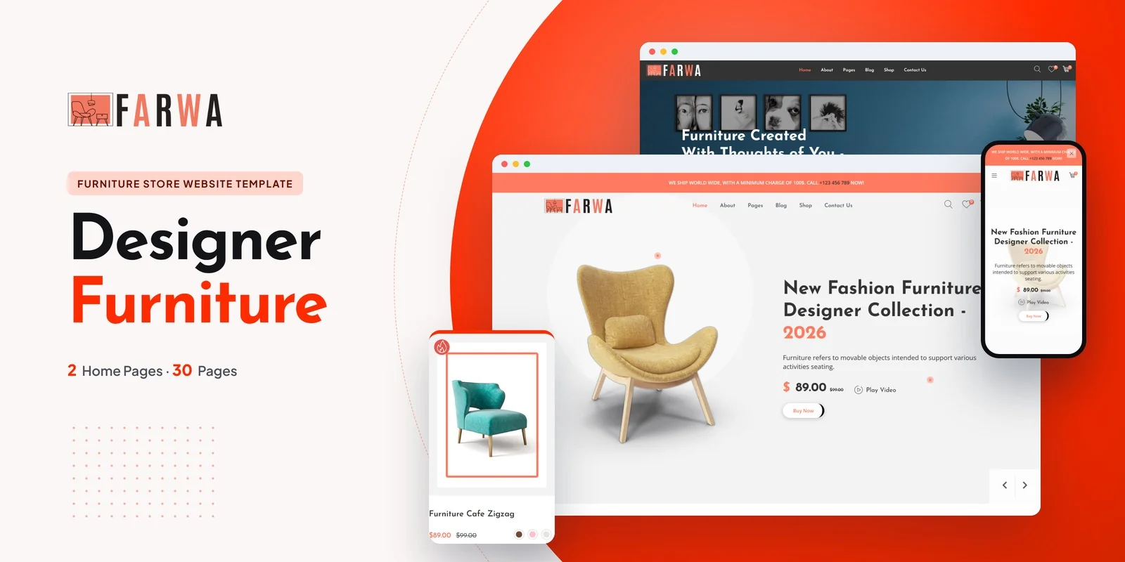
Furniture shoppers compare sofas, armchairs and side tables before they buy, so Farwa gives a showroom a Tailwind CSS home furniture store template with 30+ pages. Tailwind CSS 4 handles all of its styling. Furniture retailers, sofa and seating showrooms, home decor stores, lifestyle e-commerce brands and furnishing boutiques can all use it, as can freelancers and agencies building a store for a client.
The set has 30+ pages, including 2 home layouts. Each home layout has its own hero style and its own way of showing furniture collections. The shop archive comes in several sidebar and full-width layouts, so a seller can show a full range or a small curated group.
Owl Carousel runs the product image sliders and the featured collection carousels. Magnific Popup opens a product photo full screen, which helps when a buyer wants to check fabric or wood grain.
The shop archive and the product page matter most for this niche, because people choose furniture by looking at it. A Tailwind CSS home furniture store template has to show large photos clearly, and these two page types do that work.
Furniture is a considered purchase, so shoppers often keep pieces for later and return to them. The Wishlist page holds those favourites. This Tailwind CSS home furniture store template also covers the steps after that.
A blog lets a store share room ideas and home decor inspiration. Farwa includes five blog pages, plus pages for the brand and for a launch.
Tailwind CSS 4 puts the styling in utility classes inside the HTML. A product card or collection section can therefore be read and changed right where it sits. Because the styling travels with the markup, you can copy a block from the shop to the home page and the block looks the same there.
Breakpoint prefixes in the markup also make each layout mobile-first, so shop grids and product pages reflow on phones.
The download contains finished pages that open as they are. A Tailwind source folder is there too, for rebuilding styles after an edit. The preview images are not included, and neutral placeholders appear instead. Icons come from FontAwesome and fonts from Google Fonts.
v1.0 2026-11-01
Website Templates
Formats: HTML5Tailwind CSSPHPReact+2
Website Templates
Formats: HTML5Tailwind CSSPHPReact+2
Website Templates
Formats: HTML5Tailwind CSSReactVue+1