Included
Live Preview Details
Website Templates
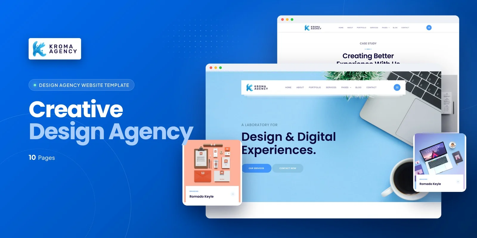
Kroma – Bootstrap 5 Design Agency HTML5 Website Template
Formats: HTML5Tailwind CSSPHPReact+2
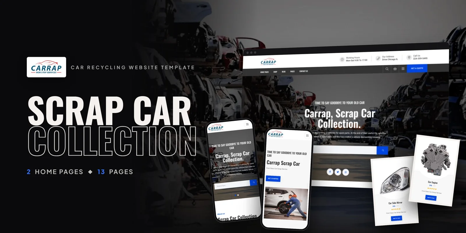
by MetropolitanHost · updated Nov 1, 2026
Download this template, and every other one, with All-Access.
Need only this one? Buy it alone for $18 on MetropolitanHost
Rental firms that need a searchable fleet and a booking flow get both in Carrap, a Tailwind CSS car rental template with 13 pages, built with Tailwind CSS 4. It suits car rental companies, auto dealerships, vehicle marketplaces, fleet management services and transport businesses alike. Freelancers and agencies will find a complete rental site they can hand to clients quickly.
This Tailwind CSS car rental template treats every vehicle as a shop item, so the same pages that sell a car can take a rental booking. The Shop page holds the whole fleet, and the filters let a visitor narrow it before opening anything.
Product Details is the page where a renter makes the decision, because the images and details sit together. It shows the vehicle images and a booking call to action. Cart and Checkout then follow, and the checkout splits into steps, which keeps a long booking form from feeling heavy. Wishlist lets a visitor keep cars on a list and compare them later.
Home v1 opens with featured vehicles, fleet statistics, testimonials and the Instagram feed, while the fleet numbers build trust at first glance. Home v2 swaps in an alternate hero with vehicle category highlights, so you can choose the one that matches your fleet.
In addition, About Us holds your company story, fleet credentials and values. Blog and Blog Details cover automotive news and rental tips, and the detail page also shows related posts. Then Contact Us adds a form, address, phone and map. Login and Signup give customers their own accounts, so repeat renters can return easily.
The compiled CSS contains only the classes the pages use, because it leaves out anything unused. Each style is written as a utility class beside the element it affects, so a Checkout step or a vehicle card is easy to read and change in place. Mobile-first breakpoint prefixes also let the Shop grid and Product Details layout adapt to each screen size, so phones and desktops both read well.
Every page opens straight away without a build step. The package contains the Tailwind source for anyone who wants to edit and rebuild the styles, and neutral placeholders take the place of the preview images. Icons come from FontAwesome and Flaticon, and fonts load from Google Fonts. For reference, the preview photos come from Freepik and Unsplash.
v1.0 2026-11-01
Website Templates
Formats: HTML5Tailwind CSSPHPReact+2
Website Templates
Formats: HTML5Tailwind CSSPHPReact+2
Website Templates
Formats: HTML5Tailwind CSSReactVue+1
Website Templates
Formats: HTML5Tailwind CSSReactVue+1